Case Studies

How I've have helped my past clients

TUTOR DOCTOR

THE OVERVIEW

Tutor Doctor franchises offer in-home, one-on-one tutoring for students from kindergarten through college. The Ontario-based company was founded in 2000 and began franchising in 2003.

THE CHALLENGE

Tutor Doctor needed a landing page for their new marketing campaign. The marketing team wasn’t satisfied with their old landing pages. One of the reasons was their overly colorful branding. The users were being distracted from the important elements on the page and the conversion rates were low.

THE PROCESS

After analyzing Tutor Doctor’s website and old landing pages we came to the conclusion that their branding looks like it’s aimed at children, and not for parents and tutors. It was too colorful, intense, and distracting. 


Our primary hypothesis was to use the same branding guidelines but limit the colors and drop some of the copy. The goal was to make the page more legible. We made the company’s awards stand out in order to increase trust. 

CLIENT REVIEW

“Filip excels not only in his creative design but he is unafraid to provide advice regarding potential blind spots. I highly recommend Filip for anyone wanting to build a landing page.”

Old Landing Page

New Wireframe

New Landing Page

DNSFILTER

THE OVERVIEW

DNSFilter is the world’s fastest DNS based threat protection and content filtering service, powered by artificial intelligence.

THE CHALLENGE

DNSFilter had underperforming Unbounce landing pages. Their marketing team wanted to align these with their brand’s design guidelines in order to increase conversions and improve customer loyalty.

THE PROCESS

After diagnosing the problems we had to take the content out of DNSFilter’s old landing pages and redesign it following their brand guidelines. We ended up with a new landing page that raised the conversion rate from 2.36% to 23.44%.


CLIENT REVIEW

Filip created a beautiful landing page for us that increased our conversion rates more than by more than 1000%

Old Landing Page

New Landing Page

RESULTS:

OLD PAGE: 2.36% CONVERSION RATE

NEW PAGE: 23.44% CONVERSION RATE

JC EBOOK CAMPAIGN

THE OVERVIEW

Jeff Clark is the editor of several investment advisories that focus on profiting from options in any market environment.

THE CHALLENGE

The traffic of this campaign came from YouTube ads. We needed a landing page that would quickly capture the prospect’s email address after they’re done watching a video where Jeff Clark talks about trading strategies. 

THE PROCESS

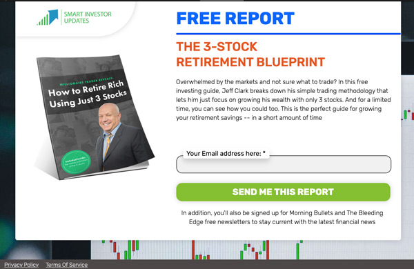
Because most of the traffic came from YouTube, we decided that the best approach was a short landing page that allows the users to take action as fast as possible.


After watching the YouTube video, most of our users were already heated up and ready to convert. Our primary landing page was converting at a good 40.34%. We decided to split test that variant against the same variant with different call to action colors. 


Turns out a variant with an orange call to action button converts at 61.23% which blew our minds!

Green CTA

OLD PAGE: 40% CONVERSION RATE

Orange CTA

NEW PAGE: 60% CONVERSION RATE

USB FACTORY

THE OVERVIEW

USBFactory is a Switzerland-based custom USB manufacturer that was established in 2008. 

THE CHALLANGE

USBFactory went through a brand redesign across their corporate website. Since their landing pages were built on Unbounce, they kept their old design. The marketing department wanted both to align the landing pages with the new brand guidelines and to test a hypothesis that having a single field form above the fold would increase conversion rates.

THE PROCESS

After analyzing their old landing page, it was obvious that the design was outdated, but most importantly, not aligned with their website and brand.


After the implementation was over, we tested the page on both mobile and desktop. We then started sending paid traffic to the page and the conversion rates doubled. Their new landing page has 12% conversion rate.

CLIENT REVIEW

Whaou! Working with Filip is just GREAT! Everything is easy and simple. Thanks a lot for your great job, I’ll come back to order more pages soon!

Old Landing Page

RESULTS:

OLD PAGE: 6% CONVERSION RATE

NEW PAGE: 12% CONVERSION RATE

New Landing Page

DTC Tech Product

THE RESULTS

The later landing page doubles the conversion rate.

Reasons why:

  1. Added a top header with some sale information.
  2. Added a logo and a call to action below it, it is a common mental model and pages that lack it seem suspicious.
  3. Made the main heading much smaller but still readable on mobile devices
  4. Added a short and concise subheading, with reviews and a call to action that feature a discount.
  5. Added a related image with a customer testimonial
  6. The new page is much easier to scan, features sale elements, and has a clear call to action that makes it easier for the user to navigate/decide.

Do you want to optimize your website pages? Sign up for a free CRO website audit with me here.

DTC Food Product Page

THE RESULTS

40% increased conversion rate. The reasons are below:


  1. Added a top banner. It adds contrast, attracts attention, and features the sale that will end
  2. Moved the product image just below the navbar. The product title is now below the image.
  3. On the image, we’ve added another element that attracts the eye featuring the sale, and few other elements .
  4. The title is the biggest typographic element that attracts the eye and explains what the product is all about.
  5. Added the stars and reviews widget that scrolls the page to the reviews.
  6. Discount pill
  7. Strong contrast for the subscribe / one type purchase component
  8. Quantity change next to the CTA
  9. Big free shipping component

Free CRO website video audit, click here.

DTC Jewelry

THE RESULTS

– Clearly state that the current page the user is on is “Your Cart”
– Clearly show items that are currently in the cart, highlight the savings
– Reduce the size of product image, save on screen real estate
– Remove the quantity picker for jewelry products
– Remove the option the edit the cart, just allowing users to remove the – product from the cart is enough
-Move the promo code form into the checkout
-Incentivize the purchase with a free gift
-Strong checkout button
-Offer a bundle discount on the cart page to increase AOV

Schedule Your 30-Minute Session Today

drop us a line and let's talk!

footer-shot